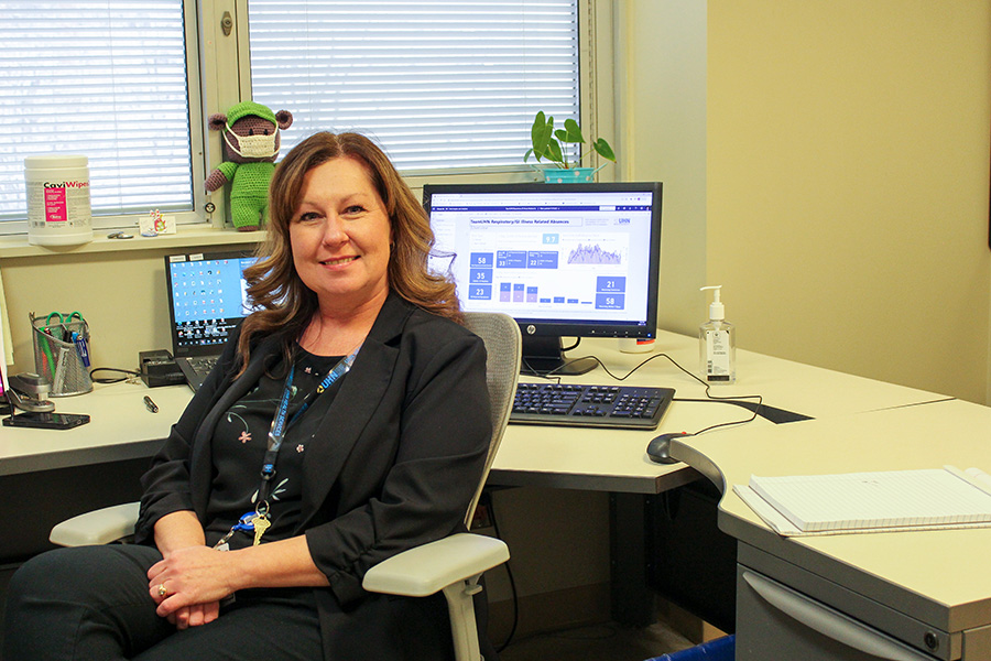
Roxanne Patel, Senior Analytics Specialist with UHN’s Data & Analytics Department, helped create the COVID-19 dashboard that Health Services and UHN leadership rely on for decision-making. She continues to work with Health Services and other leaders to adapt and evolve the dashboard to organizational needs. (Photo: UHN)
During the Omicron Wave of COVID-19 last winter, Tamara Dus, Senior Director of Health Services at University Health Network (UHN), would be at her computer every morning at 9:30 a.m. to hit the refresh button.
She was refreshing the COVID-19 dashboard, which provided a visualization – using charts, graphs and percentages – in real-time of the number of staff off work with the virus. The information was updated twice daily at 9:30 a.m. and 4:30 p.m.
“I’d sit here and I’d wait until I could hit the refresh button to see if I was going to get good news,” says Tamara, adding that at the peak of Omicron, up to 1,200 staff were off sick, heavily straining UHN’s human resources.
“We got to such large numbers during Omicron, they were numbers we had never seen before … at first, managers didn’t know who was coming, who was going, or when their return-to-work date was going to be.”
At all times – and especially during COVID waves – Tamara needs to see absentee trends to help the organization manage risk and ensure staff are safe. She hears about impacts from individuals across the organization, but using data allows her to better assess the full situation and shift away from relying on anecdotal evidence for providing guidance and making decisions.
Sometimes the decisions – and subsequent monitoring of outcomes – need to be made quickly. Daily data updates, forecasts, and trend analyses make that possible.
“Once we had the dashboard, we were able to make an educated prediction of who would be returning to work, which really helped for human resource planning,” says Tamara.
The insight that Tamara, Health Services, and UHN leadership came to rely on was created by UHN’s Data & Analytics Department, which is led by Michael Caesar.
“Part of Data & Analytics’ role is to understand the problems the organization faces then translate that into insight that will help leaders see progress, risk, or opportunities – and make decisions,” says Michael, UHN’s Chief Data & Analytics Officer.

One member of his team, Roxanne Patel, Senior Analytics Specialist, did that by helping build the COVID-19 dashboard Tamara uses, as well as a dashboard that measures staff vaccination status.
Throughout much of the pandemic, she met regularly with Health Services and various clinical teams to understand the most meaningful data that would help inform organizational decisions on COVID-19 policies and procedures – for example, a data set visually displaying the seven-day rolling average of staff positivity rates.
The Data & Analytics team remains in regular contact with Health Services to understand evolving needs so that they can update and change the way the data is displayed. Data visualization is both an art and science, understanding what is meaningful to the user, understanding the context of how they’ll be using the insight, and finding ways to present all that’s needed in simple, uncluttered ways.
When staff have respiratory symptoms or are infected with COVID-19, they fill out an online form that feeds into the dashboard.
“It allowed leaders to visualize when they could safely bring people back and what the impact on staffing would be,” says Roxanne.
The dashboard also helps inform Health Services policies around on-site activities and restrictions for TeamUHN during the pandemic. It’s what informs UHN’s red (no non-essential staff on site), yellow (reduce staff presence on-site) and green (all staff allowed on-site) pandemic phases.
“The Data & Analytics team is not making policy decisions, but rather providing tools to leadership and experts to help them make those decisions,” says Roxanne. “That was a standout moment for me … seeing the tools, the analysis that we created being used to inform decision making for leadership.”
Looking for opportunities to enhance the dashboard
The COVID-19 dashboard is only one example of how the Data & Analytics team — with their wide range of expertise – makes it possible for UHN to manage and use data to make evidence-based decisions, apply effective predictive modelling, monitor progress, and benchmark all kinds of organizational performance.
The work that Data & Analytics does may not be highly visible, but it is key to UHN’s ability to deliver quality care, education, and research – and create a safe, healthy, and equitable workplace.
The dashboard changed the game for Health Services, who was originally tracking the data in an Excel spreadsheet.
“The dashboard now takes all the information that we already had and it puts it into a nice report … it’s quicker, it’s easier,” says Tamara.
With fewer than 20 positive cases among staff on a seven-day rolling average, UHN’s pandemic phase is currently “green” – meaning all staff are allowed on site.
Tamara continues to monitor the dashboard on a daily basis and most recently worked with the team to add absences due to other respiratory illnesses, such as flu and RSV.
“I still meet regularly with the Data & Analytics team to look at opportunities to enhance or develop the dashboard,” says Tamara.


